
It’s a grapefruit Ting!
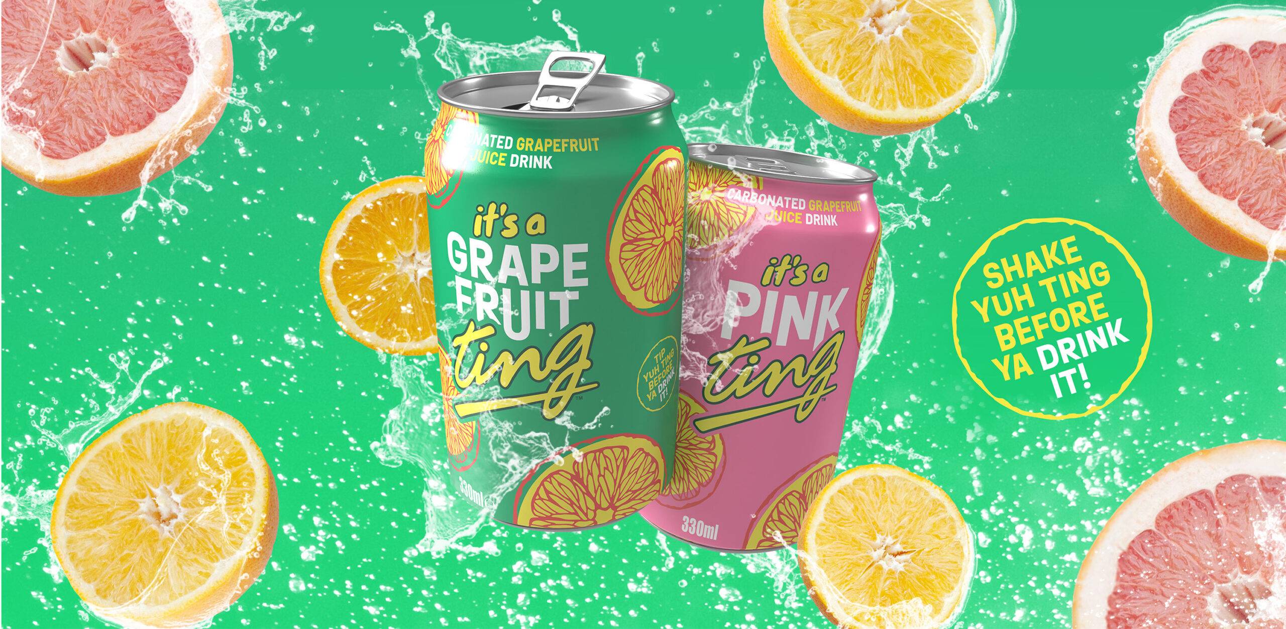
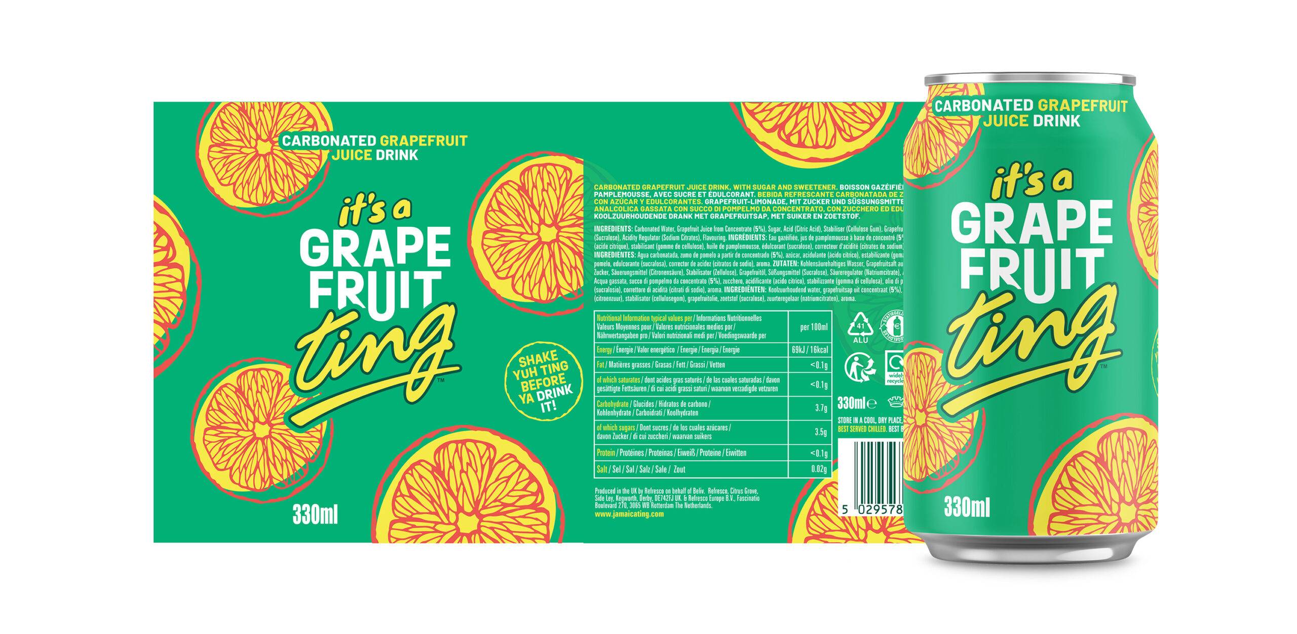
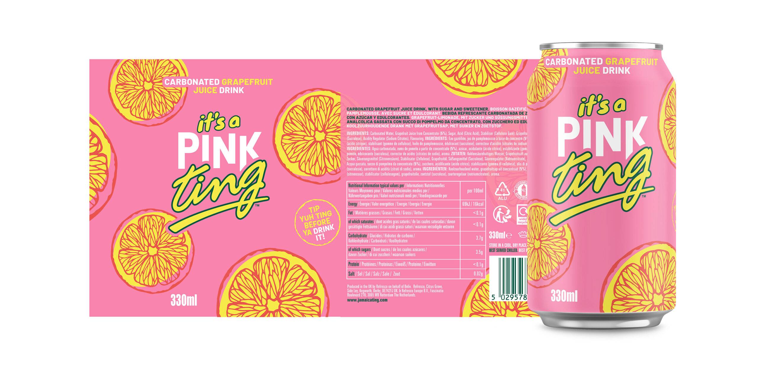
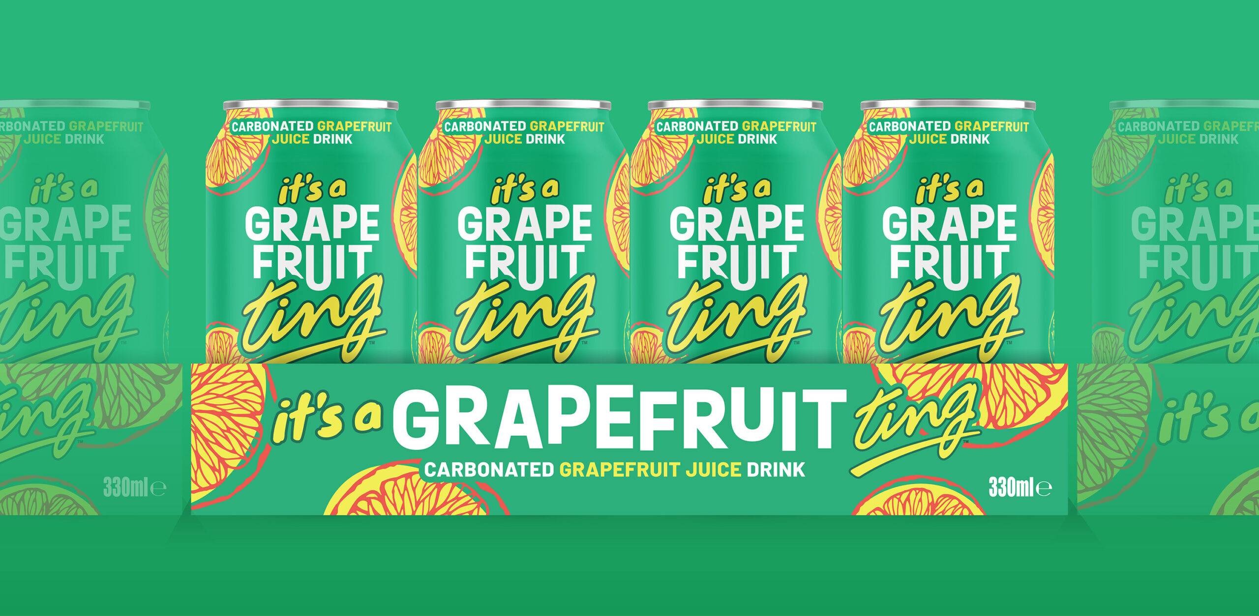
A drink with roots in South America, Ting approached us to trial a new package design to help them become the #1 grapefruit soda in the UK market. Keeping the logo and colour palette the same, the refreshed design needed to be eye-catching and appeal to the target audience whilst bringing to life the tropical grapefruit flavour.
The result was a minimalistic version of the can, using a vibrant green to modernise the original palette for the millennial market, while keeping the joyful, tropical feel. The grapefruit remains at the heart of the design using illustrations of the fruit to add texture to the can. This was rolled out successfully across the UK for Ting, and subsequently, Pink Ting, when it was launched in the UK.
See also
-

-

-
 Highland Spring - Brave by Nature VRHighland Spring - Brave by Nature VRUsing virtual reality to drive real results for the UK’s leading water brand.
 -

-

-

-
 McIntosh of StrathmoreMcIntosh of StrathmoreTraditional meals, just like your granny made – only faster.